The Magic of Prints: How Color Combinations Influence a Dress’s Expression and Mood
The Magic of Prints: How Color Combinations Influence a Dress’s Expression and Mood
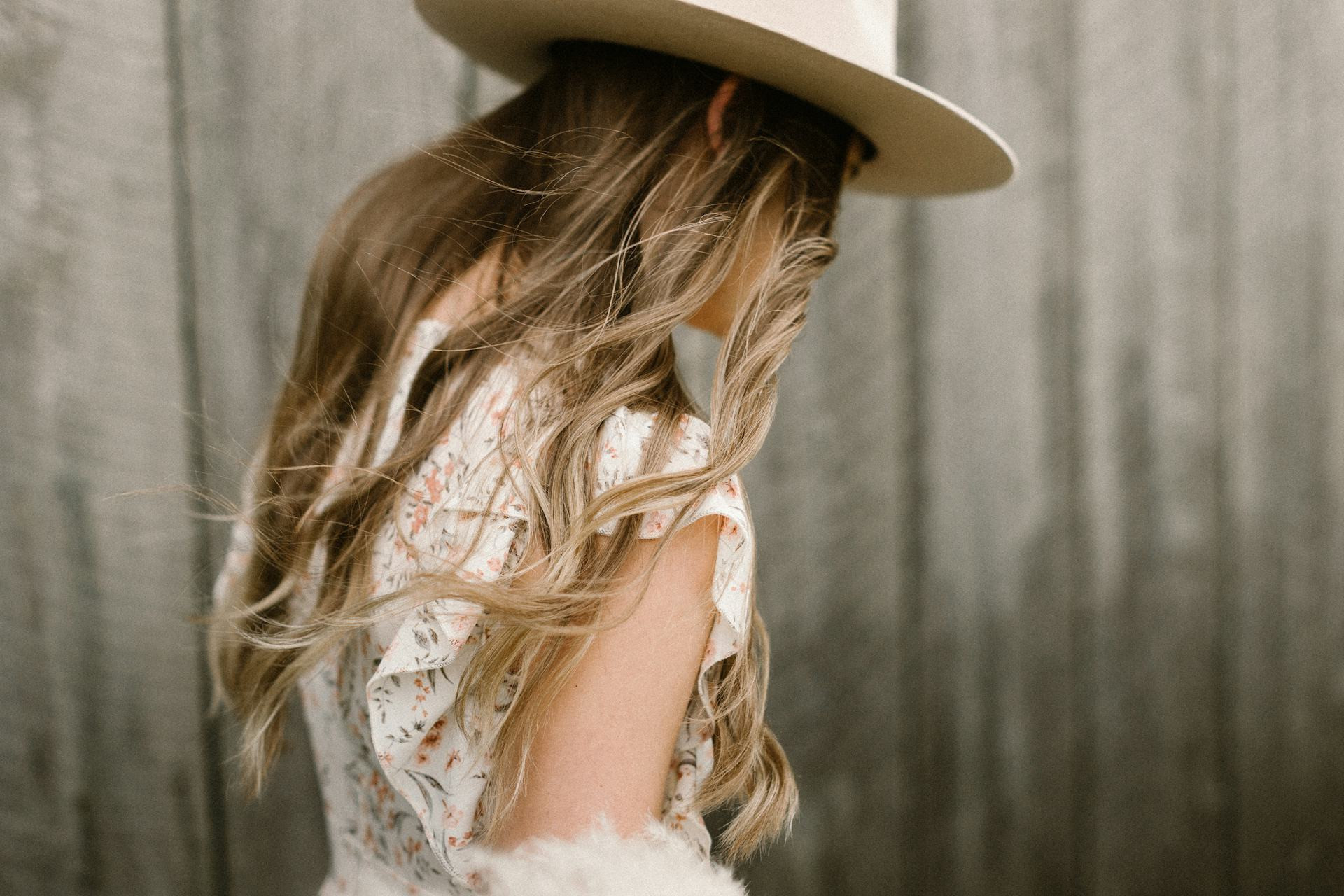
When we choose a dress, it’s rarely just the cut that defines how it feels to wear — the colors and the print are just as important. A dress with a soft floral pattern can feel romantic and airy, while one with bold geometric contrasts radiates confidence and energy. The combination of colors doesn’t just shape how others perceive us; it also influences how we feel in our clothes and the mood we project.
The Psychology of Color – More Than Just Aesthetic
Colors evoke emotions. Shades of red are often linked to passion and strength, blue to calm and trust, and green to nature and balance. When these colors come together in a print, they create a unique dynamic that can completely transform the dress’s expression.
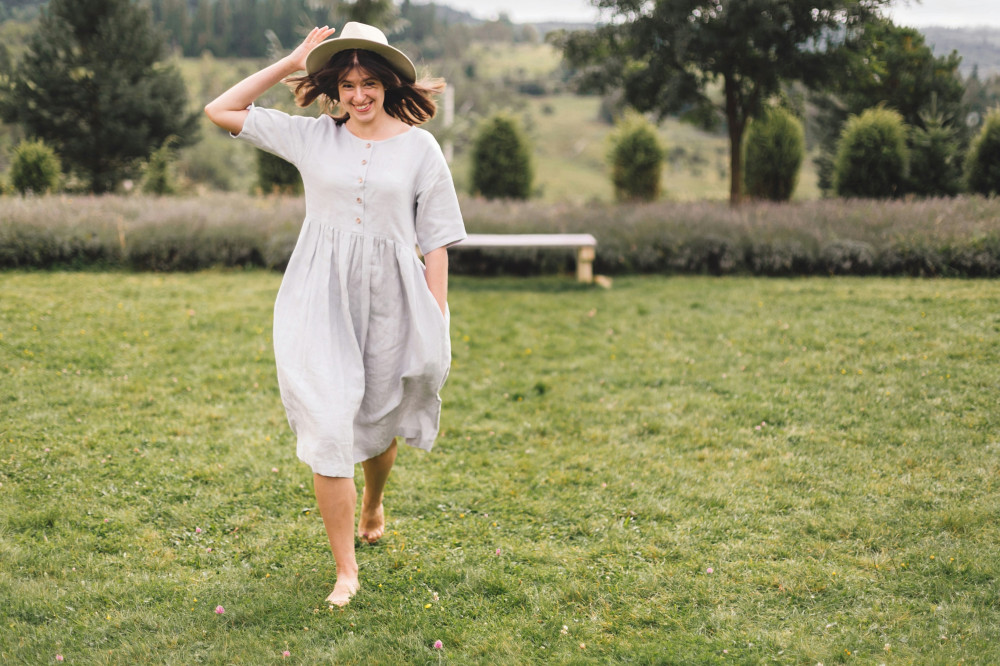
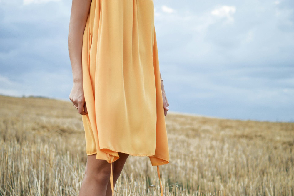
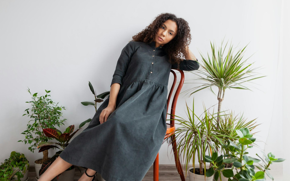
Prints with warm tones like orange, red, and yellow bring energy and vibrancy, while cooler hues such as blue and gray create a more refined and serene impression. Neutrals like beige, ivory, and soft taupe act as quiet backdrops, allowing patterns and details to stand out more clearly.
Læs også:
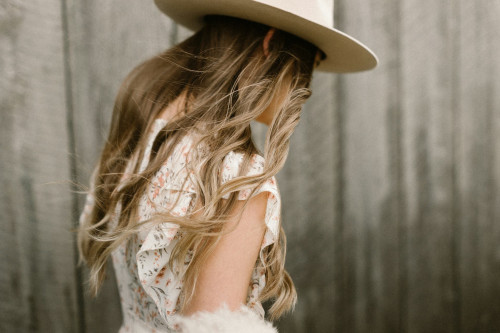
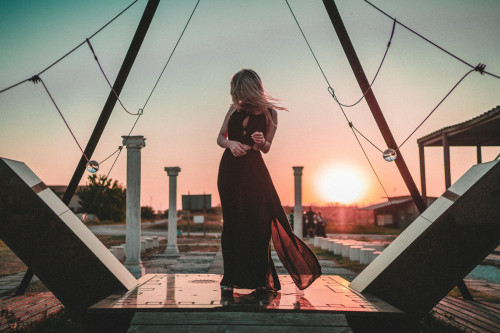
Contrast and Harmony – The Art of Balance
A successful color combination is all about balance. Too many contrasts can feel overwhelming, while too little variation can make a print appear flat. Designers often rely on the color wheel and complementary tones to achieve harmony — for instance, pairing blue and orange in a way that feels both lively and balanced.
Subtle contrasts within the same color family can also add depth. A print that blends dusty rose with deep burgundy feels more sophisticated and calm than one with sharp, high-contrast transitions.
Scale and Rhythm in Prints
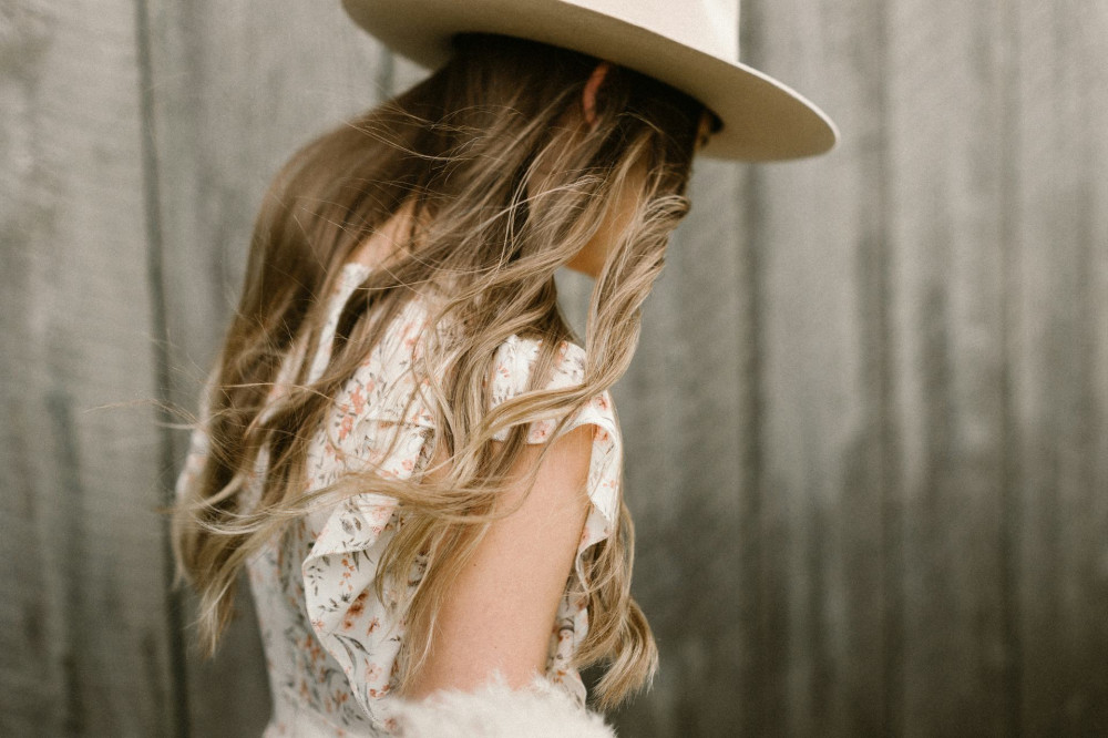
Beyond color, the size and rhythm of a print play a crucial role. Large patterns with bold color blocks draw attention and give a dress a dramatic flair. Smaller, tighter prints tend to feel more delicate and timeless, often lending a feminine or classic touch.
The rhythm of a print — how colors and shapes repeat — affects how the eye moves across the fabric. A consistent, evenly spaced pattern feels calm and orderly, while an asymmetrical or irregular print can create a sense of movement and excitement.
Mood and Occasion
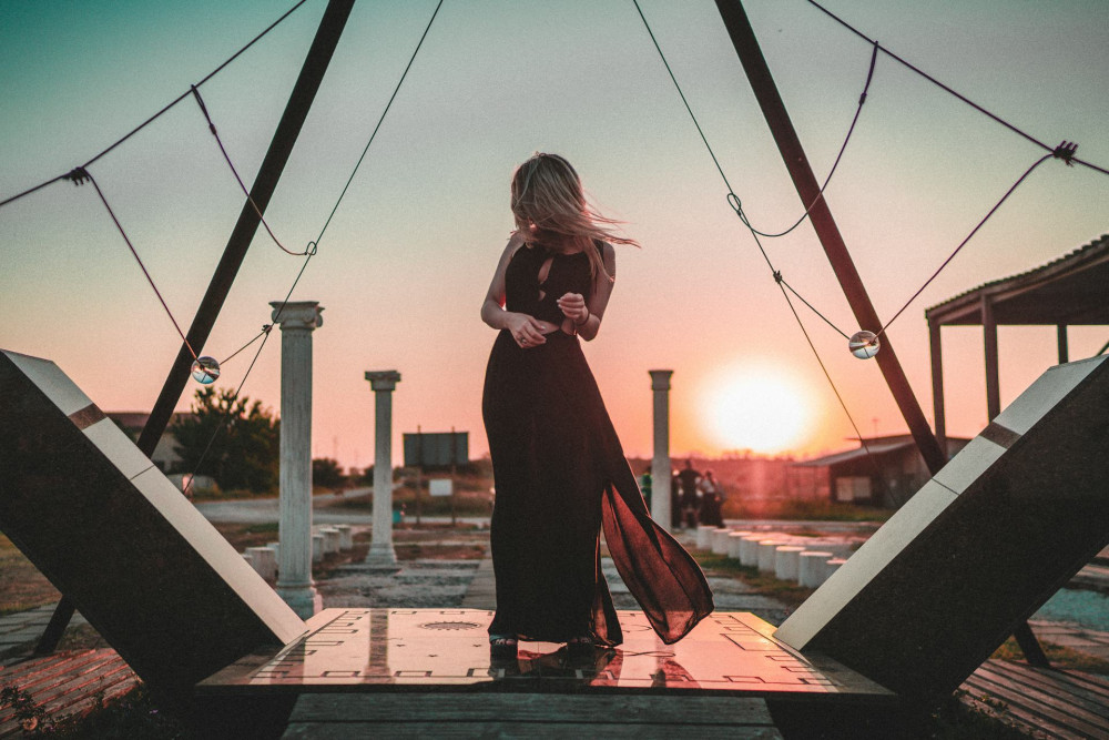
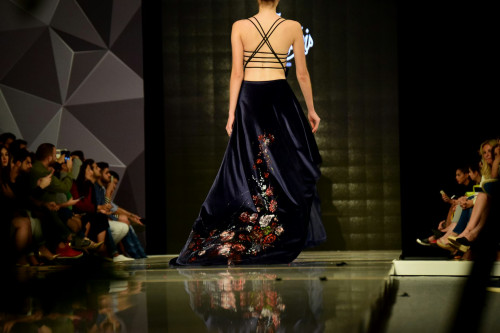
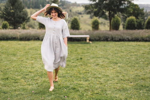
The color composition of a dress often determines when and where it feels most appropriate. Light pastels and soft gradients evoke a sense of ease, making them perfect for summer days or casual gatherings. In contrast, darker tones and strong contrasts are often associated with evening wear and festive occasions.
Nature-inspired palettes — think earthy greens, sandy neutrals, and sky blues — create a relaxed, grounded mood, while metallic tones and sharp contrasts signal glamour and confidence. Ultimately, it’s about the energy you want to express.
When Color Meets Personality
The true magic of prints and colors lies in how they interact with the person wearing them. A dress can highlight aspects of one’s personality — or help create a new mood to step into. Some people choose colors that reflect their current state of mind, while others use them to shift it.
Understanding how color combinations influence expression isn’t just about fashion; it’s about self-expression. When color, pattern, and personality align, a print becomes more than just a design — it becomes a story you wear.
Læs også: